

This article was last updated on September 16, 2024, to add sections on Advanced Stylex Techniques, Performance Considerations, and Using Custom CSS Variables for Theming.
Introduction
Stylex is a recently (as of Dec 2023) open sourced CSS-in-JS solution developed by Meta. It allows writing atomic inline CSS styles inside React/JavaScript components, and combines the power of static CSS thanks to globally accessible CSS variables. Stylex facilitates collision-free CSS by creating unique class identifiers for each style and by mitigating specificity issues with minimal usage of collision contributors (such as pseudo-classes). These make Stylex much more deterministic, reliable and scalable than other CSS-in-JS solutions like Emotion.
Stylex is especially more powerful because Stylex styles are geared to be reusable and extendable across libraries. It is also equipped with compile-time props typing for Flow and has excellent support for TypeScript -- making it easily adoptable by statically typed codebases.
With Stylex, we can go about defining colocated styles in a React component, manipulate their rendering logic and use them accordingly inline in markups. We can declare global variables outside components, export them, and then import and use them inside a given component. Globally declared variables are useful for dynamic layouts, grid systems, color palettes, typography, spacing, sizing, responsive design as well as theming.
In this introductory post, we cover how to define and use Stylex styles using the stylex.create and stylex.props APIs in an already set up Next.js application. We expend efforts to understand some of the quirks of writing collision-free inline CSS with Stylex. While doing so, we come across snippets implementing simple style declarations, style declarations with imported Stylex variables, conditional styling as well as a responsive component using media queries. We also explore how to create variables with the stylex.defineVars API and use them inside components.
We are using this example Next.js app from Facebook as a base and tweaking it to build our own page and component. If you need to, please feel free to clone it, use it locally and adopt your own from it.
Step by step, we will be covering the following topics:
- CSS-in-JS with Stylex and TypeScript
- Styling a Next.js App with Stylex
- Stylex Performance Benefits
- Using Stylex Variables in a Next.js App
- Statically Typed Styles in Stylex
- Advanced Stylex Techniques – Path to Better Flexibility
CSS-in-JS with Stylex and TypeScript
Stylex has two core APIs: the create and props methods. stylex.create() allows us to declare CSS styles with a JavaScript object. The object should have property identifiers that represent CSS classes and their values that stand for CSS rules. The stylex.props method lets us access the declared styles from within inline markups.
stylex.defineVars API facilitates declaration of global Stylex variables that represent actual CSS variables and are accessible from app-wide React components. Thanks to this, Stylex variables can be used for dynamic layouts, grid systems, color palettes, spacing, sizing, theming, etc.
In the sections and subsections ahead, we go through code snippets illustrating the use of stylex.create, stylex.props and stylex.defineVars methods that implemented Stylex styles to our Next.js page and component.
For each topic covered, we will be analyzing Stylex related changes and then try to make sense of them.
Most of our changes are in the app/page.tsx file and the <Card /> component. We'll first focus on the page.tsx file that houses the <Home /> component to see how to create and apply Stylex styles.
Styling a Next.js App with Stylex
The app/page.tsx file contains the <Home /> component and looks like this after adding our own markup with Stylex styles:
Show Home Component
import stylex from "@stylexjs/stylex";
import Card from "./components/Card";
import { colors } from "./stylex/cssVars.stylex";
import { globalTokens as $ } from "./stylex/globalTokens.stylex";
const MEDIA_MOBILE = "@media (max-width: 700px)" as const;
const style = stylex.create({
  main: {
    margin: "auto",
    fontFamily: $.fontMono,
  },
  jumbotron: {
    border: "1px transparent solid",
    padding: "16px 24px",
    backgroundColor: "#e9ecef",
  },
  jtBody: {
    padding: "8px 0",
  },
  jtHeading: {
    margin: "12px 0",
    fontFamily: $.fontSans,
    fontSize: "54px",
    fontWeight: "bold",
    color: "#4d4d4d",
  },
  jtText: {
    margin: "24px 0",
    fontSize: "24px",
  },
  jtFooter: {
    margin: "24px 0",
  },
  jtButton: {
    padding: "12px 24px",
    fontFamily: $.fontMono,
    fontSize: "20px",
    fontWeight: "bold",
    color: colors.white,
    border: "1px solid transparent",
    borderRadius: "4px",
    backgroundColor: colors.primary,
    textDecoration: {
      default: "none",
      ":hover": "underline",
    },
  },
  deck: {
    display: "flex",
    flexDirection: {
      default: "row",
      [MEDIA_MOBILE]: "column",
    },
    justifyContent: {
      default: "space-between",
      [MEDIA_MOBILE]: "center",
    },
    alignItems: {
      default: "center",
      [MEDIA_MOBILE]: "space-between",
    },
    margin: "24px auto",
  },
  cardHeading: {
    margin: "16px 0",
    fontFamily: $.fontMono,
    fontSize: "32px",
  },
  cardText: {
    margin: "16px 0",
    fontFamily: $.fontSans,
    fontSize: "16px",
  },
  featuredBg: {
    backgroundColor: "orange",
  },
});
export default function Home() {
return (
<main {...stylex.props(style.main)}>
<div {...stylex.props(style.jumbotron)}>
<div {...stylex.props(style.jtBody)}>
<h1 {...stylex.props(style.jtHeading)}>Hello, world!</h1>
<p {...stylex.props(style.jtText)}>
This is a template for a simple marketing or informational website.
It includes a large callout called a jumbotron and three supporting
pieces of content. Use it as a starting point to create something
more unique.
</p>
</div>
<div {...stylex.props(style.jtFooter)}>
<a {...stylex.props(style.jtButton)} href="#" role="button">
Learn more »
</a>
</div>
</div>
<div {...stylex.props(style.deck)}>
<Card featuredBg={{ backgroundColor: "orange" }}>
<h2 {...stylex.props(style.cardHeading)}>Heading</h2>
<p {...stylex.props(style.cardText)}>
Donec id elit non mi porta gravida at eget metus. Fusce dapibus,
tellus ac cursus commodo, tortor mauris condimentum nibh, ut
fermentum massa justo sit amet risus. Etiam porta sem malesuada
magna mollis euismod. Donec sed odio dui.{" "}
</p>
<p>
<a href="#" role="button">
View details »
</a>
</p>
</Card>
<Card>
<h2 {...stylex.props(style.cardHeading)}>Heading</h2>
<p {...stylex.props(style.cardText)}>
Donec id elit non mi porta gravida at eget metus. Fusce dapibus,
tellus ac cursus commodo, tortor mauris condimentum nibh, ut
fermentum massa justo sit amet risus. Etiam porta sem malesuada
magna mollis euismod. Donec sed odio dui.{" "}
</p>
<p>
<a href="#" role="button">
View details »
</a>
</p>
</Card>
</div>
</main>
);
}
As we can see, styling is a totally handled by Stylex. The page in browser now looks like this:
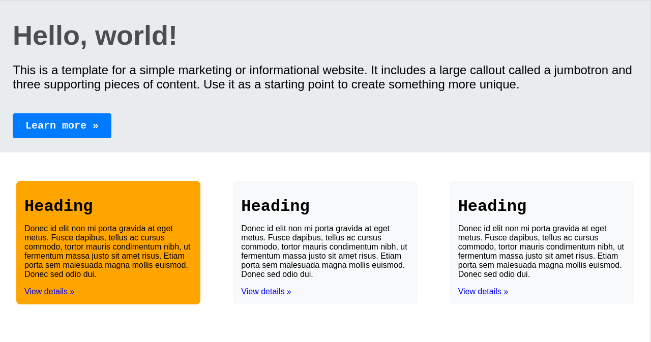
Let's break it down in the sections below.
Creating Styles with stylex.create
We have declared Stylex styles with the stylex.create method:
Show stylex.create method
const style = stylex.create({
main: {
margin: "auto",
fontFamily: $.fontMono,
},
jumbotron: {
border: "1px transparent solid",
padding: "16px 24px",
backgroundColor: "#e9ecef",
},
jtBody: {
padding: "8px 0",
},
jtHeading: {
margin: "12px 0",
fontFamily: $.fontSans,
fontSize: "54px",
fontWeight: "bold",
color: "#4d4d4d",
},
jtText: {
margin: "24px 0",
fontSize: "24px",
},
jtFooter: {
margin: "24px 0",
},
jtButton: {
padding: "12px 24px",
fontFamily: $.fontMono,
fontSize: "20px",
fontWeight: "bold",
color: colors.white,
border: "1px solid transparent",
borderRadius: "4px",
backgroundColor: colors.primary,
textDecoration: {
default: "none",
":hover": "underline",
},
},
deck: {
display: "flex",
flexDirection: {
default: "row",
[MEDIA_MOBILE]: "column",
},
justifyContent: {
default: "space-between",
[MEDIA_MOBILE]: "center",
},
alignItems: {
default: "center",
[MEDIA_MOBILE]: "space-between",
},
margin: "24px auto",
},
cardHeading: {
margin: "16px 0",
fontFamily: $.fontMono,
fontSize: "32px",
},
cardText: {
margin: "16px 0",
fontFamily: $.fontSans,
fontSize: "16px",
},
featuredBg: {
backgroundColor: "orange",
},
});
It takes a styles object with property indentifiers that represent a CSS class and values that compose the actual CSS rules. Under the hood, Stylex creates a CSS class with an identifier starting with x for each of the Stylex style object property. When the style is applied to a JSX element with stylex.props, this generated CSS class is added to the element's className property.
Stylex Style Declarations - Must be Statically Analyzable
There are some constraints to declaring Stylex styles. For example, the style object properties
- should not go beyond one level deep, as further nesting belongs to the element's CSS properties.
- cannot call non-Stylex functions.
- cannot import values from non-Stylex modules.
As a general rule: Stylex style declarations must be statically analyzable. See a more comprehensive list here.
Stylex Styles with Imported Stylex Variables
It is typical to import and use Stylex variables:
{
    fontFamily: $.fontMono,
}
Use of global Stylex variables is important for dynamic layouts, responsive design and generating variants for spacing, typography, colors and themes.
Stylex Conditional Style Definitions
We can apply conditional style definitions in order to assign CSS pseudo-classes:
textDecoration: {
  default: "none",
  ':hover': "underline",
},
Stylex Media Queries
We are also able to maintain responsive design with conditionally defined media queries:
flexDirection: {
  default: "row",
  [MEDIA_MOBILE]: "column",
},
justifyContent: {
  default: "space-between",
  [MEDIA_MOBILE]: "center",
},
alignItems: {
  default: "center",
  [MEDIA_MOBILE]: "space-between",
},
With the above styles declaration, we have defined local, atomic styles intended for our JSX elements.
stylex.props - Applying Styles in Stylex
We are then applying the above declared styles inside our JSX markup, inline and atomically:
return (
<main {...stylex.props(style.main)}>
<div {...stylex.props(style.jumbotron)}>
<div {...stylex.props(style.jtBody)}>
<h1 {...stylex.props(style.jtHeading)}>Hello, world!</h1>
<p {...stylex.props(style.jtText)}>
This is a template for a simple marketing or informational website. It
includes a large callout called a jumbotron and three supporting
pieces of content. Use it as a starting point to create something more
unique.
</p>
</div>
<div {...stylex.props(style.jtFooter)}>
<a {...stylex.props(style.jtButton)} href="#" role="button">
Learn more »
</a>
</div>
</div>
<div {...stylex.props(style.deck)}>
<Card featuredBg={{ backgroundColor: "orange" }}>
<h2 {...stylex.props(style.cardHeading)}>Heading</h2>
<p {...stylex.props(style.cardText)}>
Donec id elit non mi porta gravida at eget metus. Fusce dapibus,
tellus ac cursus commodo, tortor mauris condimentum nibh, ut fermentum
massa justo sit amet risus. Etiam porta sem malesuada magna mollis
euismod. Donec sed odio dui.{" "}
</p>
<p>
<a href="#" role="button">
View details »
</a>
</p>
</Card>
<Card>
<h2 {...stylex.props(style.cardHeading)}>Heading</h2>
<p {...stylex.props(style.cardText)}>
Donec id elit non mi porta gravida at eget metus. Fusce dapibus,
tellus ac cursus commodo, tortor mauris condimentum nibh, ut fermentum
massa justo sit amet risus. Etiam porta sem malesuada magna mollis
euismod. Donec sed odio dui.{" "}
</p>
<p>
<a href="#" role="button">
View details »
</a>
</p>
</Card>
</div>
</main>
);
Notice, for each style applied, we are invoking the stylex.props method and passing the style object property as it's argument. Under the hood, Stylex grabs the CSS class identifier it generated with the x prefix and adds it to the className property of the JSX element.
We are able to pass multiple styles to stylex.props() and all get merged into a single class. When specificity becomes an issue in the merge, the last style gets ranked the most. Please feel free to learn more in this section of the docs.
Stylex Performance Benefits
I have been digging into some of the performance-related aspects of Stylex, and some clear advantages do seem to be there, actually—mostly concerning fast and efficient performance in terms of apps.
Atomic CSS for Smaller Bundle Size
One big advantage is that Stylex utilizes atomic CSS in that for each style rule, it generates tiny, reusable CSS classes. That keeps the final CSS bundle smaller since it avoids duplication of styles. For example:
// Using Stylex to create atomic styles
const style = stylex.create({
  button: {
    backgroundColor: "blue", // Reusable class for background color
    color: "white", // Reusable class for text color
    padding: "12px",
  },
  text: {
    fontSize: "16px", // Reusable font size class
    color: "black",
  },
});
In this case, Stylex generates CSS classes for backgroundColor first, then for color, and finally, for fontSize. Now, if somewhere else in your code, you use backgroundColor: "blue", Stylex can avoid generating a class. It uses this already existing class; hence, that keeps the CSS bundle size smaller.
Static Analysis for Faster Performance
Another big advantage of Stylex is the fact that it does a lot of static analysis at compile-time. Whereas something like Styled Components or Emotion would generate styles dynamically at runtime, Stylex is generating everything at build time. This greatly reduces runtime overhead and is therefore a big win for performance, especially important for bigger apps.
Here is one example:
// Stylex creates styles at compile-time
const style = stylex.create({
  card: {
    margin: "24px",
    padding: "16px",
    border: "1px solid #ddd",
  },
});
With Stylex, this code compiles down to static CSS at build time. At render time, there isn't any extra browser overhead, which is often the case with other CSS-in-JS solutions that correctly do on-the-fly CSS generation.
Reduced Specificity Issues
One sweet thing about Stylex: It reduces specificity problems. By not having deep nesting and crazy pseudo-class use, Stylex keeps CSS lean, which is easy for the browser to process. Here is an example where we add pseudo-classes:
const buttonStyle = stylex.create({
  button: {
    color: "white",
    backgroundColor: "blue",
    ":hover": {
      backgroundColor: "darkblue", // Hover effect without specificity change
    },
  },
});
All of these pseudo-classes in Stylex are handled efficiently without increasing specificity, making it easier to manage styles in larger apps.
Using Stylex Variables in a Next.js App
As seen above, we are already using the global Stylex variable, $, in our <Home /> component:
{
    fontFamily: $.fontSans,
}
We are using these example tokens from Stylex docs and using their fonts in our app. This particular example provides insight into the capabilities of Stylex variables in designing complex dynamic, responsive layouts with easily customizable variants for color, spacing, typography, theming and more.
Just to get an idea, in this post, we explore how to define the simplest set of color palette.
Stylex Variables - Defining and Using Variables with stylex.defineVars
Besides modifying our page and component, in app/stylex/cssVars.ts we've declared a set of colors using stylex.defineVars:
import stylex from "@stylexjs/stylex";

export const colors = stylex.defineVars({
  primary: "#007bff",
  secondary: "#f8f9fa",
  white: "#f8f9fa",
});
stylex.defineVars's job is to make the exported colors variable available globally to the emitted static CSS styles and to the TS app for importing from any of its React components. In our app, we are able to use necessary colors from Stylex colors, in app/page.tsx as well as inside <Card />:
backgroundColor: colors.secondary,
Statically Typed Styles in Stylex
Stylex applies compile-time type-checking to style props passed to a component. It is typical of Flow, and has all the required support with TypeScript as well.
As an example, the <Card /> component accepts a featuredBg prop that is typed with StyleXArray<any> type:
import stylex from "@stylexjs/stylex";
import { ReactNode } from "react";
import { StyleXArray } from "@stylexjs/stylex/lib/StyleXTypes";
import { colors } from "../stylex/cssVars.stylex";

const styles = stylex.create({
  card: {
    margin: "32px",
    padding: "16px",
    border: "1px spolid transparent",
    borderRadius: "8px",
    backgroundColor: colors.secondary,
  },
});

type Props = Readonly<{
  featuredBg?: StyleXArray<any>;
  children: ReactNode;
}>;

export default function Card({ featuredBg, children }: Props) {
  return <div {...stylex.props(styles.card, featuredBg)}>{children}</div>;
}
Static typing of Stylex styles allows them to be typed accurately and provide type-safety and stability to our codebase.
Advanced Stylex Techniques – Path to Better Flexibility
Lately, I've been fiddling around with some more advanced Stylex techniques that could really help drive some dynamism and flexibility into our styles—especially when it comes to those really complex layouts or UI components. Let me show you a few examples.
Conditional Styling with Props
As mentioned earlier, with Stylex, we can conditionally apply styles depending on props. That becomes really useful when we want to apply different styles upon the state of or the context a component operates under.
Here is an example where we style a button differently depending on whether it has a class of "primary" or "secondary":
const buttonStyles = stylex.create({
  primary: {
    backgroundColor: "blue",
    color: "white",
  },
  secondary: {
    backgroundColor: "gray",
    color: "black",
  },
});

function Button({ type }) {
  const style =
    type === "primary" ? buttonStyles.primary : buttonStyles.secondary;
  return <button {...stylex.props(style)}>Click Me</button>;
}
In this example, this button would apply either the primary or secondary style according to a type prop. This makes it quite easy to handle different design variations inside one single component.
Media Queries for Responsive Design
Another good feature is how Stylex handles media queries. We are able to define styles for different screen sizes directly within the function stylex.create(). That's great for building responsive components.
Here's an example:
const MEDIA_MOBILE = "@media (max-width: 600px)";

const cardStyles = stylex.create({
  card: {
    padding: "24px",
    backgroundColor: "lightgray",
    [MEDIA_MOBILE]: {
      padding: "12px", // Adjust padding for mobile
      backgroundColor: "darkgray", // Change background on mobile
    },
  },
});

function Card() {
  return <div {...stylex.props(cardStyles.card)}>Responsive Card</div>;
}
With that, the card would adjust its padding along with its background color when viewed on small-sized screens. It's very easy to manage responsive designs with Stylex without developing separate CSS files.
Dynamic Styles with JavaScript
Sometimes the styles should be dynamic, depending on a condition, like user interactions or state changes. In these cases, Stylex allows mixing JavaScript logic with style props.
The following example shows a box whose height will change dynamically based on a slider value:
const boxStyles = stylex.create({
  box: {
    backgroundColor: "lightblue",
    transition: "height 0.3s",
  },
});

function DynamicBox() {
  const [height, setHeight] = React.useState(100);

  return (
    <div>
      <input
        type="range"
        min="100"
        max="300"
        value={height}
        onChange={(e) => setHeight(e.target.value)}
      />
      <div {...stylex.props(boxStyles.box)} style={{ height: `${height}px` }}>
        Dynamic Box
      </div>
    </div>
  );
}
In this example, the value of height is dynamically updated based on user input, and the box smoothly resizes.
Theming with Custom CSS Variables
We can also use Stylex's defineVars to define our own CSS variables, which makes theming so much easier. You define a theme—like dark or light mode—and apply it globally across your app.
Here's how to define and use variables for theming:
const themeVars = stylex.defineVars({
  primaryColor: "#007bff",
  backgroundColor: "#ffffff",
});

const themeStyles = stylex.create({
  container: {
    backgroundColor: themeVars.backgroundColor,
    color: themeVars.primaryColor,
  },
});

function ThemedComponent() {
  return <div {...stylex.props(themeStyles.container)}>Themed Component</div>;
}
Now, you can toggle the themeVars to apply dark mode by editing the value of the variables. This is super flexible when you need to handle global styles or theme changes.
Summary
In this post, we quickly covered the basics of Stylex by applying styling in a Next.js app. We focused particularly on the core stylex.create and stylex.props APIs for defining CSS-in-JS styles to our page and component. We also covered how Stylex variables are defined and used with the stylex.defineVars method. In the end, we saw an example of how style props are statically typed with Stylex in a component.
These APIs make Stylex a powerful toolbox of inline and static CSS styling that helps produce reusable, extendable and performant stying as sought out by scalable large applications. Stylex is a newborn library passing through infancy and thanks to its capabilities of globally available variables, clean and lean API surface, we should be seeing much more robust and tiny UI frameworks built on top it very soon.