

This article was last updated on August 19, 2024, to add sections on Customizing Heroicons and Optimizing Icon Performance.
Introduction
Heroicons are SVG-based icons packaged by the creators of TailwindCSS. They come in two size variants, 20, which is suitable for small buttons and form elements, and a 24 size, that is useful for primary navigation buttons like call to action and hero sections. 24 size comes as solid and outline.
A Heroicon is a React component that returns an <svg> element with props passed to it. We are able to set values for the properties of the <svg> element, such as className, stroke, and fill, by passing them to the Heroicon component.
TailwindCSS <svg> classes such as stroke-{color}-{saturation} are very useful in styling regular <svg> elements. Heroicons take it one step forward by allowing the className prop to a Heroicon JSX element. This means we can pass TailwindCSS classes to a Heroicon component to style its svg> element. For example, we can set the stroke color of a Heroicon <svg> with TailwindCSS classes simply by adding stroke-{color}-{saturation} to the Heroicon component's className.
Besides, we can also pass regular properties such as stroke, fill, width and height of the <svg> to the Heroicon, which is assigned to the <svg> element.
In this post, we use Heroicons with both TailwindCSS and non-Tailwind classes. We'll work on an already built navbar that currently has Tailwind styled regular <svg> icons (they are the same <svg>'s produced from the Heroicons we'll be using). We'll be replacing them with Heroicon React components and styling them accordingly.
The existing navbar is available in this repository. As using Heroicons is pretty easy, to grasp how the examples work, it is enough just to follow the JSX. If you want to run the app and see what's going on in the browser when the style changes, please follow the steps below to clone the repo and run it locally.
Steps we'll cover:
Preparation
Clone the repository here.
Then open it in your code editor and run:
npm install
npm run start
Install Heroicons
npm install @heroicons/react
Then to compile newly added TailwindCSS classes, run the CSS compiler in watch mode:
npx tailwindcss -i ./src/styles/styles.css -o ./public/styles/styles.css --watch
A Navbar with Heroicons
Currently, the <Navbar /> component looks like this:
import React, { useState } from "react";
import TailzupLogo from "../icons/TailzupLogo";
import { Avatar } from "../icons/Avatar";
import { HamburgerIcon } from "../icons/HamburgerIcon";
import { SearchIcon } from "../icons/SearchIcon";

const Navbar = () => {
  const [isMobileMenuOpen, setIsMobileMenuOpen] = useState(false);
  const menuHidden = !isMobileMenuOpen ? "hidden md:block" : "";
  return (
    <nav className="navbar">
      <div className="brand-wrapper">
        <a className="brand" href="/">
          <TailzupLogo color="orange" />
        </a>
      </div>
      <div
        className={`${menuHidden} border-t border-slate-500 text-amber-50 transition-all duration-1000 ease-in-out md:border-none`}
      >
        <div id="items" className="items-strip">
          <div id="left" className="items-left">
            <input
              className="text-input"
              type="email"
              placeholder="Find Donald or something..."
            />
            <SearchIcon />
          </div>
          <div id="right">
            <ul className="items-list">
              <li className="nav-item md:order-last">
                <a href="/">
                  <Avatar />
                </a>
              </li>
              <li className="nav-item">
                <a className="nav-link" href="/">
                  Home
                </a>
              </li>
              <li className="nav-item">
                <a className="nav-link" href="/">
                  Friends
                </a>
              </li>
              <li className="nav-item">
                <a className="nav-link" href="/">
                  Messages
                </a>
              </li>
            </ul>
          </div>
        </div>
      </div>
      <div
        className={`absolute right-4 top-3 rounded border border-orange-400 p-1 text-slate-500 hover:bg-orange-200 hover:text-slate-300 md:hidden`}
        onClick={() => setIsMobileMenuOpen(!isMobileMenuOpen)}
      >
        <a href="/">
          <HamburgerIcon />
        </a>
      </div>
    </nav>
  );
};

export default Navbar;
<SearchIcon />, <Avatar /> and <HanburgerIcon /> icons contain <svg> elements produced from Heroicons. They are available in this folder: src/components/icons/. However, we will be replacing them with actual Heroicon React components.
Styles
All the classes used on the components are styled with regular Tailwind and CSS classes. You can find them in this stylesheet:
src/styles/styles.css
@tailwind base;
@tailwind components;
@tailwind utilities;

:root {
  --primary-color: rgb(223, 232, 247);
  --secondary-color: rgb(182, 76, 27);
  --grayscale: rgb(226, 218, 218);
  --friendly: green;
  --neutral: blue;
  --warning: yellow;
  --danger: crimson;
  --forbidden: black;
}

* {
  margin: 0;
  padding: 0;
  box-sizing: border-box;
}

body {
  min-width: 450px;
}

.navbar {
  @apply sticky top-0 mx-auto flex h-auto w-full flex-col justify-start bg-slate-600 px-2 md:flex-row md:items-center md:justify-between;
}

.brand-wrapper {
  @apply flex h-14 w-full flex-1 items-center justify-start self-start bg-slate-600;
}

.brand {
  max-width: 12rem;
  color: var(--primary-color);
  @apply p-2 text-4xl;
}

.items-strip {
  @apply my-2 flex flex-col items-start justify-start md:flex-row md:items-center md:justify-start;
}

.items-left {
  @apply order-last mx-2 flex items-center justify-center p-2 md:order-none;
}

.items-list {
  @apply flex flex-col md:flex-row md:items-center md:justify-start;
}

.nav-item {
  @apply mx-2 w-full rounded p-1 transition-all hover:scale-105 hover:shadow hover:backdrop-brightness-125 lg:mx-8 lg:w-auto;
}

.nav-link {
  @apply flex items-center justify-start p-1 text-center;
}

.text-input {
  @apply rounded-l border px-2 py-0.5 text-slate-800;
}

.avatar {
  width: 2rem;
  height: 2rem;
  color: whitesmoke;
}

.icon {
  width: 1.5rem;
  height: 1.5rem;
  color: whitesmoke;
}

.tailzup-logo {
  width: 4rem;
  height: 4rem;
}

.glow {
  animation: glow 0.8s alternate infinite;
}

@keyframes glow {
  0% {
    filter: drop-shadow(0 0 1px #fff) drop-shadow(0 0 2px #fff) drop-shadow(
        0 0 3px #ff80b3
      ) drop-shadow(0 0 4px #ff4d94) drop-shadow(0 0 5px #ff0066);
  }
  29% {
    filter: drop-shadow(0 0 2px #fff) drop-shadow(0 0 4px #fff) drop-shadow(
        0 0 6px #ff80b3
      ) drop-shadow(0 0 8px #ff4d94) drop-shadow(0 0 10px #ff0066);
  }

  92% {
    filter: drop-shadow(0 0 3px #fff) drop-shadow(0 0 6px #fff) drop-shadow(
        0 0 9px #ff80b3
      ) drop-shadow(0 0 12px #ff4d94) drop-shadow(0 0 15px #ff0066);
  }
}
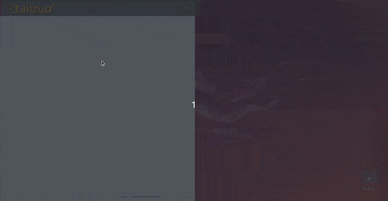
The navbar now looks like this:
Adding and Styling Heroicons with TailwindCSS
We'll replace the existing icons with Heroicons components. So, let's import and replace:
import React, { useState } from "react";
import TailzupLogo from "../icons/TailzupLogo";
import {
  Bars4Icon,
  MagnifyingGlassIcon,
  UserIcon,
} from "@heroicons/react/24/outline";

const Navbar = () => {
  const [isMobileMenuOpen, setIsMobileMenuOpen] = useState(false);
  const menuHidden = !isMobileMenuOpen ? "hidden md:block" : "";
  return (
    <nav className="navbar">
      <div className="brand-wrapper">
        <a className="brand" href="/">
          <TailzupLogo color="orange" />
        </a>
      </div>
      <div
        className={`${menuHidden} border-t border-slate-500 text-amber-50 transition-all duration-1000 ease-in-out md:border-none`}
      >
        <div id="items" className="items-strip">
          <div id="left" className="items-left">
            <input
              className="text-input"
              type="email"
              placeholder="Find donald trump or something..."
            />
            <MagnifyingGlassIcon className="mx-1 h-6 w-6 stroke-orange-400" />
          </div>
          <div id="right">
            <ul className="items-list">
              <li className="nav-item md:order-last">
                <a href="/">
                  <UserIcon
                    className="glow h-8 w-8"
                    stroke="pink"
                    strokeWidth={1.2}
                  />
                </a>
              </li>
              <li className="nav-item">
                <a className="nav-link" href="/">
                  Home
                </a>
              </li>
              <li className="nav-item">
                <a className="nav-link" href="/">
                  Friends
                </a>
              </li>
              <li className="nav-item">
                <a className="nav-link" href="/">
                  Messages
                </a>
              </li>
            </ul>
          </div>
        </div>
      </div>
      <div
        className={`absolute right-4 top-3 rounded border border-orange-400 p-1 text-slate-500 hover:bg-orange-200 hover:text-slate-300 md:hidden`}
        onClick={() => setIsMobileMenuOpen(!isMobileMenuOpen)}
      >
        <a href="/">
          <Bars4Icon className="h-6 w-6 stroke-orange-400" />
        </a>
      </div>
    </nav>
  );
};

export default Navbar;
With the Heroicon Reract components, everything should remain unchanged.
Notice that we are passing CSS classes with the className prop to the following Heroicons components: <MagnifyingGlassIcon />, <UserIcon /> and <Bars4Icon />. The classes then get relayed to the <svg> element produced by the Heroicon. Effortlessly.
As discussed below, we are using three types of CSS classes.
Using Regular TailwindCSS Utilities with Heroicons
We can use regular Tailwind CSS utilities like h-6 w-6:
<MagnifyingGlassIcon className="mx-1 h-6 w-6 stroke-orange-400" />
In this case, we are using spacing utilities for height, width and margin.
Using SVG Related TailwindCSS Utilities with Heroicons
We have also used a SVG related TailwindCSS class in the <MagnifyingGlassIcon /> component - stroke-orange-400 to set the stroke of the icon.
Another example is this:
<Bars4Icon className="h-6 w-6 stroke-orange-400" />
Internally, stroke-{color}-{saturation} value is relayed to the stroke property of the <svg> element with `stroke= "currentColor```.
<svg fill="none" stroke="currentColor"></svg>
Using non-TailwindCSS Classes with Heroicons
We can use non-Tailwind classes as well:
<UserIcon className="glow h-8 w-8" stroke="pink" strokeWidth={1.2} />
For the <UserIcon />, we are applying a glow class that animates the icon with a glow filter. It's completely custom CSS and looks like this:
.glow {
  animation: glow 0.8s alternate infinite;
}

@keyframes glow {
  0% {
    filter: drop-shadow(0 0 1px #fff) drop-shadow(0 0 2px #fff) drop-shadow(
        0 0 3px #ff80b3
      ) drop-shadow(0 0 4px #ff4d94) drop-shadow(0 0 5px #ff0066);
  }
  29% {
    filter: drop-shadow(0 0 2px #fff) drop-shadow(0 0 4px #fff) drop-shadow(
        0 0 6px #ff80b3
      ) drop-shadow(0 0 8px #ff4d94) drop-shadow(0 0 10px #ff0066);
  }

  92% {
    filter: drop-shadow(0 0 3px #fff) drop-shadow(0 0 6px #fff) drop-shadow(
        0 0 9px #ff80b3
      ) drop-shadow(0 0 12px #ff4d94) drop-shadow(0 0 15px #ff0066);
  }
}
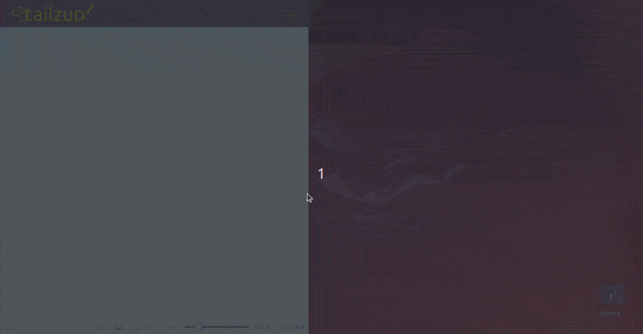
With the above changes Heroicons and their styles, the navbar looks like this:
Applying Native <svg> Properties to Heroicons
Notice also that we are applying stroke and strokeWidth to <UserIcon />:
<UserIcon className="glow h-8 w-8" stroke="pink" strokeWidth={1.2} />
Native <svg> properties passed to Heroicons also get relayed to the <svg> element inside.
Applying Responsive TailwindCSS Utils to Heroicons
Okay. Now, we'll consider the case for responsive use of Heroicons. We want each nav item to have its own icon left of its text. Like this:
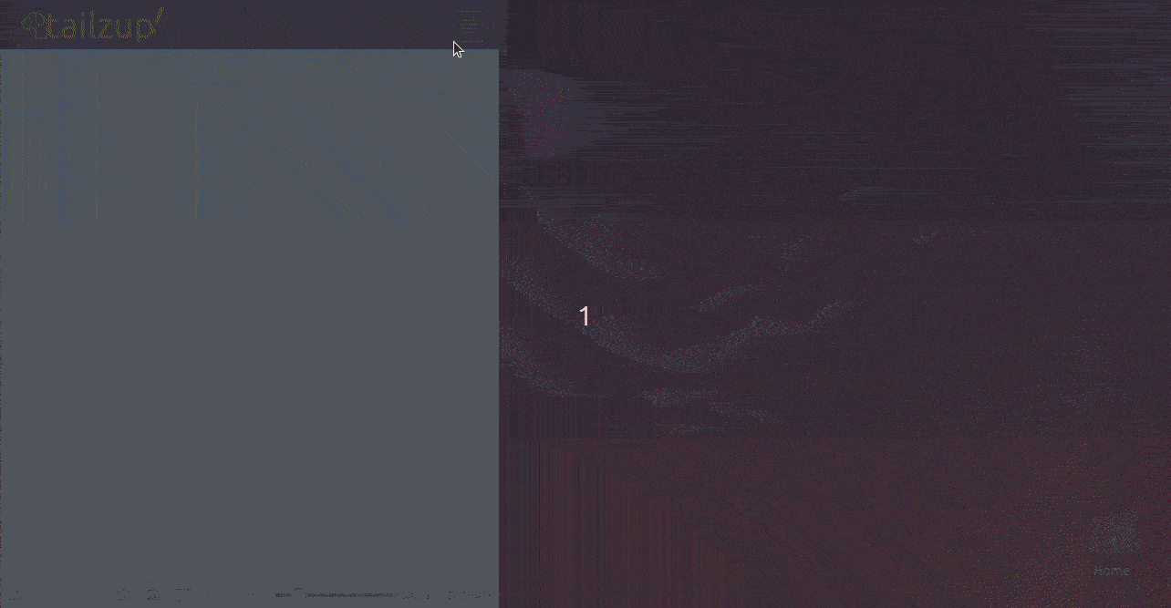
So, we'll go ahead and add the icons for each nav item:
Show Navbar.tsx
import React, { useState } from "react";
import TailzupLogo from "../icons/TailzupLogo";
import {
  Bars4Icon,
  ChatBubbleLeftRightIcon,
  HomeIcon,
  MagnifyingGlassIcon,
  UserGroupIcon,
  UserIcon,
} from "@heroicons/react/24/outline";

const Navbar = () => {
  const [isMobileMenuOpen, setIsMobileMenuOpen] = useState(false);
  const menuHidden = !isMobileMenuOpen ? "hidden md:block" : "";
  return (
    <nav className="navbar">
      <div className="brand-wrapper">
        <a className="brand" href="/">
          <TailzupLogo color="orange" />
        </a>
      </div>
      <div
        className={`${menuHidden} border-t border-slate-500 text-amber-50 transition-all duration-1000 ease-in-out md:border-none`}
      >
        <div id="items" className="items-strip">
          <div id="left" className="items-left">
            <input
              className="text-input"
              type="email"
              placeholder="Find Donald  or something..."
            />
            <MagnifyingGlassIcon className="mx-1 h-6 w-6 stroke-orange-400" />
          </div>
          <div id="right">
            <ul className="items-list">
              <li className="nav-item md:order-last">
                <a href="/">
                  <UserIcon
                    className="glow h-8 w-8"
                    stroke="pink"
                    strokeWidth={1.2}
                  />
                </a>
              </li>
              <li className="nav-item">
                <a className="nav-link" href="/">
                  <HomeIcon className="h-6 w-6 md:hidden lg:block" />
                  <span className="mx-2">Home</span>
                </a>
              </li>
              <li className="nav-item">
                <a className="nav-link" href="/">
                  <UserGroupIcon className="h-6 w-6 md:hidden lg:block" />
                  <span className="mx-2">Friends</span>
                </a>
              </li>
              <li className="nav-item">
                <a className="nav-link" href="/">
                  <ChatBubbleLeftRightIcon className="h-6 w-6 md:hidden lg:block" />
                  <span className="mx-2">Messages</span>
                </a>
              </li>
            </ul>
          </div>
        </div>
      </div>
      <div
        className={`absolute right-4 top-3 rounded border border-orange-400 p-1 text-slate-500 hover:bg-orange-200 hover:text-slate-300 md:hidden`}
        onClick={() => setIsMobileMenuOpen(!isMobileMenuOpen)}
      >
        <a href="/">
          <Bars4Icon className="h-6 w-6 stroke-orange-400" />
        </a>
      </div>
    </nav>
  );
};

export default Navbar;
With md:hidden lg:block we are changing the visibility of the icon using responsive classes for each nav item. At md, we want the icon to be hidden and show up back at lg:
<UserGroupIcon className="h-6 w-6 md:hidden lg:block" />
Customizing Heroicons
Customizing Heroicons to your application's design and branding is possible, and here are a few advanced ways of enhancing them:
Advanced SVG Manipulations
- Path Adjustments: Direct editing of SVG path data to create custom shapes or adjust a default one. It's done by editing the
dattribute within the<path>tag of an SVG that describes the outline for the icon.
import React from "react";

const CustomIcon = () => (
  <svg
    xmlns="http://www.w3.org/2000/svg"
    viewBox="0 0 24 24"
    fill="none"
    stroke="currentColor"
    className="h-6 w-6"
  >
    <path
      d="M12 2a10 10 0 110 20 10 10 0 010-20zm1 14h-2v-2h2v2zm0-4h-2V7h2v5z"
      strokeLinecap="round"
      strokeLinejoin="round"
      strokeWidth={2}
    />
  </svg>
);

export default CustomIcon;
- Transformations: By applying a few transformations such as scaling, rotation, or skewing, you can change some elements in an SVG. For this purpose, the
transformattribute is used. To rotate an icon, for example, the<svg>element could havetransform="rotate(45)". This would rotate the icon by 45°.
import { ArrowPathIcon } from "@heroicons/react/24/outline";

const RotatedIcon = () => (
  <ArrowPathIcon className="h-8 w-8" transform="rotate(45)" stroke="blue" />
);
- Animations: You can animate your Heroicons using CSS or JavaScript. For example, you can create an animation with a
stroke-widthor continuous rotation by applying CSS properties to@keyframes.
import { ArrowRightIcon } from "@heroicons/react/24/outline";

const AnimatedIcon = () => (
  <ArrowRightIcon className="h-8 w-8 animate-bounce text-red-500" />
);
Theming Icons
- Dynamic Styling with TailwindCSS: You're able to do dynamic classes with TailwindCSS, which means you toggle classes depending on some user actions or the state of your app. For example, you can change the color of an icon when it is hovered over, or if some condition is true, by using conditional class names.
import { StarIcon } from "@heroicons/react/24/solid";

const ThemedIcon = ({ isActive }) => (
  <StarIcon
    className={`h-6 w-6 ${isActive ? "text-yellow-500" : "text-gray-300"}`}
  />
);
- Dark Mode: Implement dark mode support. This can easily be done in TailwindCSS with the
dark:modifier. You can, for instance, define fill colors asfill-current text-gray-900 dark:text-gray-100for both light and dark modes.
import { MoonIcon } from "@heroicons/react/24/outline";

const DarkModeIcon = () => (
  <MoonIcon className="h-6 w-6 text-gray-900 dark:text-gray-100" />
);
- Custom Themes: TailwindCSS can also be extended by adding custom themes that allow imposing specific styles onto the Heroicons. This is done by defining new color schemes, stroke widths, and various other properties inside a Tailwind configuration file, then applying those new properties to the Heroicon.
// tailwind.config.js
module.exports = {
  theme: {
    extend: {
      colors: {
        customBlue: "#1fb6ff",
      },
    },
  },
};
import { CogIcon } from "@heroicons/react/24/solid";

const CustomThemedIcon = () => <CogIcon className="text-customBlue h-6 w-6" />;
This way, you will be able to design unique branded icons that are fully integrated into the design language of your application, thus boosting the general user experience.
Optimizing Icon Performance
The point of icon performance optimization, especially in web applications, is to improve user experience and speed up the time taken to load. Here are a few ways to go about that with some practical examples:
Use SVG Icons Over Icon Fonts
SVG icons are typically more performant compared to icon fonts because they don't carry the overhead of loading an entire set of fonts when you need just a few icons. Additionally, SVGs are much more scalable and customizable.
Avoid using FontAwesome, and instead use SVGs directly or libraries like Heroicons.
import { StarIcon } from "@heroicons/react/24/solid";

const ExampleIcon = () => <StarIcon className="h-6 w-6 text-yellow-500" />;
Here, StarIcon is used as an SVG so that only the necessary icon is loaded, minimizing load times and improving performance.
Optimize SVG Files
Reducing file size means optimizing SVG files: removing unnecessary metadata, lowering the precision of paths, and simplifying shapes.
Use tools like SVGO to optimize SVG files beforehand.
npx svgo input.svg -o output.svg
This command reduces the size of the input.svg file by optimizing it and removing unnecessary elements.
Lazy Load Icons
In an application that uses a large number of icons, lazy loading ensures that only the necessary icons are loaded when needed rather than all at once, improving performance.
import React, { Suspense, lazy } from "react";

const StarIcon = lazy(() => import("@heroicons/react/24/solid/StarIcon"));

const LazyLoadedIcon = () => (
  <Suspense fallback={<div>Loading...</div>}>
    <StarIcon className="h-6 w-6 text-yellow-500" />
  </Suspense>
);
This approach defers loading the StarIcon until it’s actually needed, reducing the initial load time.
Minimize the Use of Multiple Icon Sets
Loading multiple icon libraries together can significantly increase your JavaScript bundle size. Stick to a single icon set whenever possible, or simply use the ones you really need.
import { HomeIcon, UserIcon } from "@heroicons/react/24/outline";

const Navbar = () => (
  <nav>
    <HomeIcon className="h-6 w-6 text-blue-500" />
    <UserIcon className="h-6 w-6 text-green-500" />
  </nav>
);
This approach avoids unnecessary imports, keeping the bundle size minimal.
Leverage a CDN
If you are using popular icon sets like Heroicons or FontAwesome, consider loading your icons with a CDN. This can cache the contents effectively and reduce the load on your server.
<link
  rel="stylesheet"
  href="https://cdnjs.cloudflare.com/ajax/libs/font-awesome/6.0.0-beta3/css/all.min.css"
/>
This method serves icons from a globally distributed CDN, reducing latency and improving load times.
Sprite Sheets for Multiple Icons
When dealing with projects that require lots of icons, combining them all into a single SVG sprite sheet is recommended. This approach saves multiple HTTP requests, which ultimately decreases page load times.
<svg class="hidden">
  <symbol id="icon-home" viewBox="0 0 24 24">
<!-- SVG Path -->
  </symbol>
  <symbol id="icon-user" viewBox="0 0 24 24">
<!-- SVG Path -->
  </symbol>
 </svg>

 <svg class="icon">
  <use xlink:href="#icon-home"></use>
 </svg>
 <svg class="icon">
  <use xlink:href="#icon-user"></use>
 </svg>
This technique allows multiple icons to be loaded in a single HTTP request, reducing overall load time.
Summary
In this post, we quickly picked how to use Heroicons with TailwindCSS and non-Tailwind classes. We found that Heroicons produce an <svg element which receives styles from the JSX component via className, and other native properties like stroke, fill, height, width, etc. We saw that, in order to style a Heroicon <svg>, we can pass related TailwindCSS classes like stroke-{color}-{saturation} and non Tailwind classes to className prop of the Heroicon component. We can also pass properties like stroke, fill, etc., to a Heroicon to style its <svg>. As usual, Heroicons can also be manipulated using responsive classes.